|
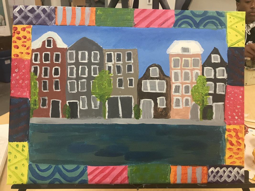
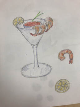
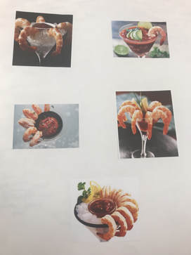
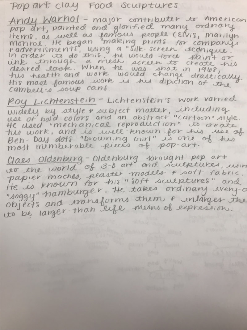
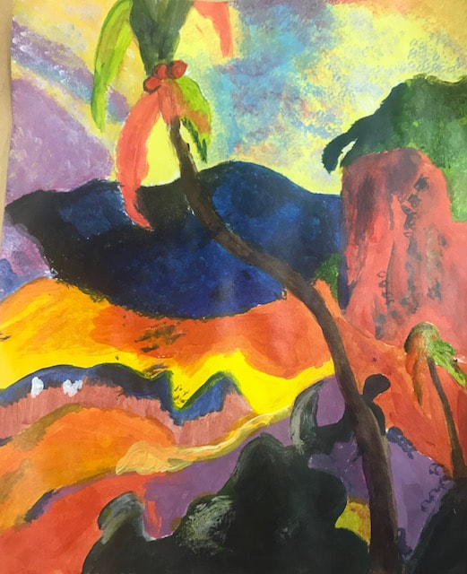
My artist that I chose was Faith Ringgold, and I chose to do a cityscape of Amsterdam, since part of her style was simplifying things, and I had a lot of pictures of the city from when I visited back in 2013. I chose to add a "quilt" border since she was known to do a lot of her work on quilts. Progress
Self Evaluation1. Who was your referenced artist for the painting? Name 4 main ideas you used from your research to create your painting.
Name-Faith Ringgold Main Ideas: Simplicity, borders, color, quilt border 2. Describe the craftsmanship of your painting. (Is it neat and well executed?) I would say that my painting is not as neat or well executed as I would like, mostly due to a lack of time and rushing to finish everything at the end of senior year. 3. What was the most difficult part of this project? I think the most difficult part of this project was the planning: what I wanted to paint, how I wanted to execute it and keep it in line with my artists' style. 4. Describe your color choices and how they reflect the work of your chosen artist? I tried to use a lot of bright colors while still keeping the painting semi-realistic because my Faith Ringgold uses a lot of bright and solid colors in her paintings. 5. Describe how the style of your landscape reflects your chosen artist. I chose I city-scape for my landscape because even though Ringgold's most common subject was people, she also dabbled in city-scapes (such as San Fransisco) and I felt her style transferd easier to a city than a nature landscape. 6. What do you think your chosen artist would say if he or she could see your painting today? I think she would give me some advice on how to improve my technique to make it cleaner. 7. What would you do differently if you were to do this project again? I would take more time to make it cleaner and not as messy/rushed.
0 Comments
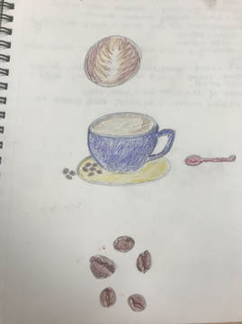
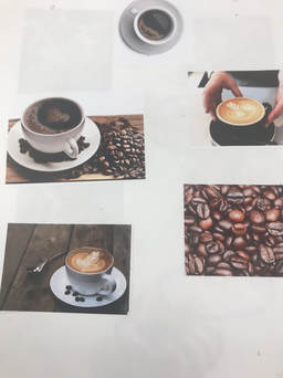
For the clay unit, our assignment was to imitate the style of pop art artists in some form of food. I chose to do a coffee mug, plate and espresso beans, using glaze for everything but the latte art. ProgressFinal ProductReflection1. Describe the craftsmanship of your sculpture. (Is it neat and well executed?) The craftsmanship leaves a little to be desired, I feel if I hadn't been in such a rush it may had been a bit better. The mug I completed by using coils and slipping and scoring, while the plate was made by molding it against the bottom of a plastic plate.
2. What was the most difficult part of this project? For me, the most difficult part of the project proved to be the espresso beans, it took me so many tries to try and get a realistic bean size and shape. 3. Did your color choices work together harmoniously? I think they do, especially with the glaze I feel that all the colors work well together and pop against each other. 4. Is your sculpture interesting from all views? I think so, from a lot of views it's the same since it's pretty simple, but I think any view of the plate where you can see the espresso beans is interesting. 5. Describe the differences in constructing a sculpture and doing something 2D. Sculpting is very different than anything 2D because you have to think and worry about all angles and dimensions, rather then just the composition from one angle. 6. How did you create textures in your sculpture? For the plate and the mug my goal was to make as smooth of a texture as possible, so I used a rib-bone tool for that, for the "latte" surface I used a sponge, and for the espresso beans again i tried to make the outside as smooth as possible, but for the "dent" I just used a needle tool. 7. Does your sculpture look like the actual food? How did you accomplish this? I'd say the espresso beans looked pretty realistic, I accomplished this by molding them to size and using a dark brown glaze to imitate the color. 8. What would you do differently if you were to do this project again? I might chose a different subject matter, to be able to use more texture in the pieces to imitate the food rather than a lot of smooth objects with glaze.
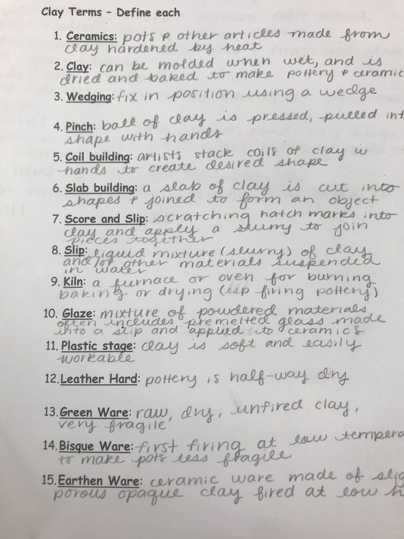
In preparation for our clay unit, we researched three pop artists that we would be mimicking n style for our "pop art" clay sculptures, and researched and learned various clay terms as well.
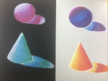
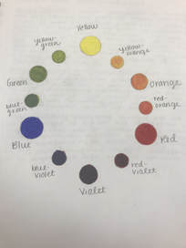
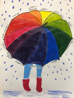
In order to practice with blending colors with prisma, a few of our first assignments were creating spheres and cones to learn how to establish a light source and shade, and create a color wheel to learn how to create colors with only the primary colors in preparation of our final project: a three color self portrait.
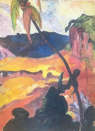
To practice and master how to use and mix acrylic paints, we were each given a portion of an acrylic painting to recreate as closely as possible.
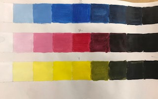
To start off our painting unit, our first assignments were to create three value charts using the primary colors and make a creative color wheel to learn how to blend colors and how to make shades and tints.
|
Megan PetersonSenior at Apex High School. Archives
June 2018
Categories |
 RSS Feed
